 By Natalia Miteva
“More than 250 end beneficiaries and representatives of parties with a vested interest availed themselves of the multi-level intervention aimed at preventing school dropout in the target group…”
Still with us? Didn’t think so.
Even the best results can remain misunderstood and undervalued if they are conveyed in obscure jargon. Using long words with Latin roots does not make anything clearer, nor does it make an explanation more effective. It is crucial to find accessible ways to present the impressive results of your work to the rest of the world. Here are some easy ways to get people to notice your outcomes.
1. Tell the story of a person whose life you’ve changed.
Every decent journalistic article written in recent years starts with the story of an ordinary person illustrating a larger theme. This is intentional. Humans are not statistics, and no one wants to read academic texts about nameless multitudes, at least not outside scientific journals. For example, to illustrate that “children are now more motivated to go to school,” you could tell the story of fourth-grader Stoyan from Karnobat, who high-fives the principal and likes hanging out at school. When you tell the story of a participant in your program, he transforms from a “beneficiary” into a flesh-and-blood human being whose life has ups and downs like our own. We look at him and we see ourselves. Also, don’t underestimate visual memory. By telling a story, you paint a picture that the reader will associate with the impact of your work.
 2. Make an infographic.
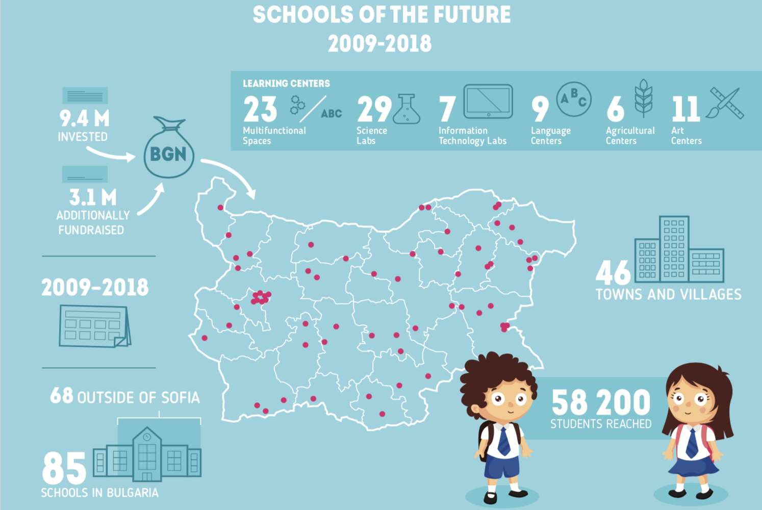
Infographics are graphics that contain a lot of information (hence the name) in an easy-to-process form. You can’t pour data, graphics, maps, arrows, and tons of text into a single page and expect anyone to remember any of it. Infographics are an extremely effective way to present quantitative results (how many and what kind of people you trained) and to show the link between activities and impact (what they became, where they are now). Infographics look good in PowerPoint presentations and in your monthly newsletter. The most memorable infographic I have come across recently showed the countries of origin of the players in the 2018 World Cup in soccer.
3. Create an engaging video.
Nothing is as good as personal experience, but a well-made video comes close. Trailers aim to “grab” audiences by highlighting a movie’s best moments. We should strive to do the same when presenting our work in video format. The key questions to ask before creating a video: What message do we want to send? What is it most important to show? Who is going to watch it? An effective video shouldn’t be longer than 2-3 minutes. Any longer than that, and I’m taking a coffee break.
4. Use active voice.
People love action and want to be impressed. So, use active voice by saying “the program changed their lives” instead of “(they) have been included in a life-changing program to increase economic activity.” I’m not saying you ought to exaggerate and come off as a miracle worker, but modesty never got anyone anywhere either. “We gave 30 people with special skills access to jobs.” “We helped 80 children start school.” “We gave 20 young families access to sustainable incomes.” Clear, meaningful, and to-the-point.
 5. Offer small, constant doses of positivity.
If your annual report is like a puzzle, present pieces of it frequently and in small, manageable doses. Each week, you could present the stories of different program participants or different outcomes or share one important statistic.
In other words, we need to speak regular people’s language. They’re faced with overwhelming quantities of information, so giving them huge volumes of data is tantamount to sharing zero data. Your audience should remember a few key results and sustain a mental image of your work. If anything, that’s more realistic than expecting them to open your 125-page report.
Yogi Berra said it best: “If you don’t know where you’re going, you’ll end up someplace else.” We need clearly defined goals to be able to present any kind of impact. HERE
Natalia Miteva is director of education at the America for Bulgaria Foundation and an experienced presenter who frequently has to “translate” complex data into comprehensible language.
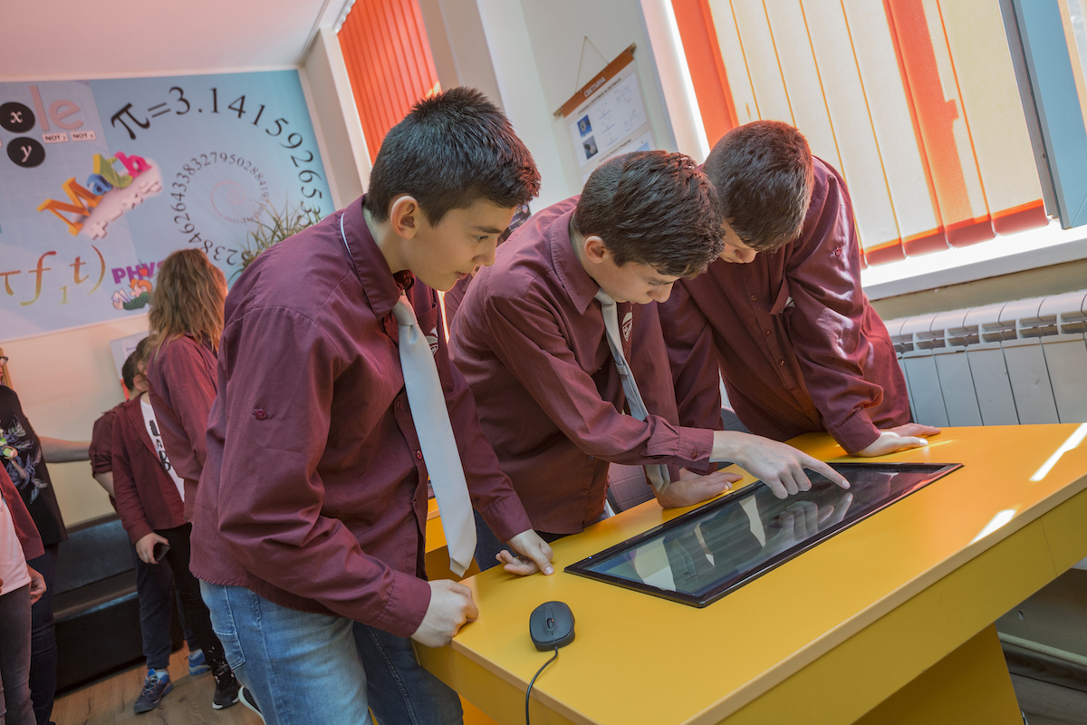
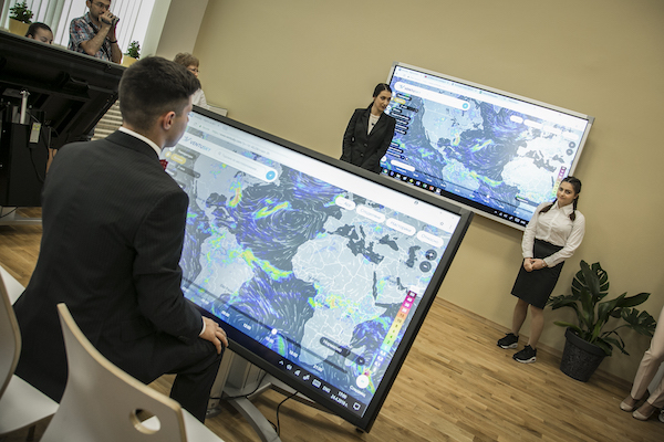
The photos are from Svetlina Primary & Middle School in the village of Topolitsa and Sofia’s William Gladstone School.